Creating a dynamic bathroom space can be an exciting challenge. The right use of contrasting colors can transform a standard bathroom into a visually striking oasis. By thoughtfully selecting colors that oppose each other on the color wheel, one can enhance the room’s depth and interest while showcasing personal style.
Contrast isn’t just about choosing colors; it also involves considering textures, patterns, and finishes. Unique combinations, like pairing matte and glossy tiles, can create a sense of balance and sophistication. Understanding how to use these elements effectively makes it easier to craft a bathroom that feels both inviting and stylish.
Readers will discover how contrasting colors not only elevate aesthetics but also make a space feel larger and more welcoming. From color theory to practical tips, this blog post will explore the art of using contrast to create a bathroom that stands out.
The Fundamentals of Color Theory
Color theory serves as the foundation for creating appealing designs in any space, including bathrooms. Understanding how colors interact can enhance the atmosphere and aesthetic of a room. Key aspects include the color wheel, complementary colors, and the psychological effects of color choices.
Understanding the Color Wheel
The color wheel is a visual tool that organizes colors into a circular format. It illustrates the relationships between primary, secondary, and tertiary colors.
- Primary Colors: Red, blue, and yellow are the building blocks of the color wheel.
- Secondary Colors: Mixing primary colors results in secondary colors: green, orange, and purple.
- Tertiary Colors: These are made by mixing a primary with a secondary color.
Using the color wheel helps in selecting color schemes that work harmoniously together. For example, a balanced bathroom design might use colors across the wheel to create contrast and interest.
Complementary Colors in Design
Complementary colors are opposite each other on the color wheel and can create a striking visual contrast. These pairs energize a space and draw attention to specific features.
For instance, blue and orange or red and green can highlight fixtures or tiles in a bathroom. Using complementary colors adds depth and vibrancy.
To effectively incorporate them, one should use one color as the dominant shade and the other as an accent. This strategy brings a lively dynamic while preventing the space from feeling chaotic.
The Psychological Impact of Color Choices
Colors carry different psychological meanings and can influence emotions and behaviors.
- Blue: Often associated with tranquility and calmness, making it a great choice for relaxation in a bathroom.
- Yellow: This color can evoke feelings of happiness and energy; it’s perfect for adding a cheerful touch.
- Green: Representing nature, green can create a refreshing and restorative atmosphere.
These emotional responses can guide color selection. A thoughtful choice of colors can turn a bathroom into a serene retreat or a vibrant space, depending on personal preference and desired ambiance.
Designing with Contrast

Contrast is essential in creating dynamic bathroom spaces. By using bold color pairings and balancing textures and materials, one can achieve an engaging and visually striking environment. Thoughtful application of these principles can transform a standard bathroom into a stylish retreat.
Bold Pairings for Bathroom Interiors
Using bold colors can make a significant impact in bathroom design. Pairing complementary colors, like deep navy and bright orange, creates a striking visual effect. These colors can be applied through wall paint, tiles, or decorative elements.
Consider using a color wheel to identify opposing shades. Rich hues like emerald green can balance soft neutrals, offering a sophisticated look. Accent pieces, such as towels or artwork, can feature these bold colors without overwhelming the space.
Another effective method is to use varying shades of the same color. This technique adds depth while maintaining a cohesive feel. Bright accents against darker backgrounds draw the eye and create focal points.
Achieving Balance with Textures and Materials
Incorporating different textures adds complexity and intrigue to a bathroom. For instance, smooth tiles can be paired with rough stone accents. This contrast highlights features and encourages exploration within the space.
Mixing materials is also important. A glass shower enclosure can contrast beautifully with wooden cabinetry. This combination provides warmth and modernity.
Another approach is to layer soft fabrics, like plush rugs or towels, against hard surfaces. Such contrasts enhance comfort and style.
Lighting plays a crucial role, too. A well-placed lamp or pendant can spotlight textures, adding even more interest. Thoughtful placement can enhance contrast, making the space feel more dynamic.
Application and Best Practices

To create a dynamic bathroom space through contrasting colors, careful planning is essential. This involves selecting the right color palette, considering lighting effects, and thoughtfully integrating color accents through accessories.
Choosing Your Palette: Tips and Techniques
Selecting a color palette requires understanding the basics of color theory. Contrasting colors can energize a space. He or she should start with a dominant color, which sets the room’s mood. Next, introduce one or two contrasting colors that enhance visual interest.
Using a color wheel can simplify this process. Colors opposite each other, like blue and orange, create strong contrasts. It is also helpful to consider existing bathroom elements, such as tiles and fixtures, to ensure a cohesive look. Group shades into three categories: primary, secondary, and accent colors. This method helps in achieving balance without overwhelming the senses.
Lighting Considerations for Color Display
Lighting plays a crucial role in how colors are perceived. Natural light can enhance colors during the day, but artificial lighting affects mood at night.
Warm lighting tends to soften colors, making them feel more inviting. Cool lighting can create a sharper look, which may highlight contrasts effectively.
It is advisable to test paint colors at different times of the day. This practice helps in understanding how light impacts hues. She or he might use dimmers to adjust brightness as needed. Additionally, light fixtures with adjustable settings can help in achieving the desired ambiance.
Accessorizing with Color Accents
Accessories are key to emphasizing contrasting colors in a bathroom. Items such as towels, rugs, and artwork can introduce pops of color without committing to larger changes.
Choosing vibrant accessories can effectively highlight neutral walls or fixtures. For example, a bright orange towel can add a splash of color to a blue palette.
It is important to maintain a balance. Too many colors can clutter the look. A good rule of thumb is to stick to a maximum of three accent colors. This approach helps to maintain visual harmony while still making a bold statement. Regular changes to these accents can refresh the bathroom’s look over time without a complete overhaul.
Real-World Examples

Contrasting colors can elevate the design of a bathroom, creating a space that feels both inviting and stylish. The following examples highlight how different approaches to color can transform a bathroom’s look and feel.
Modern Bathroom Inspirations
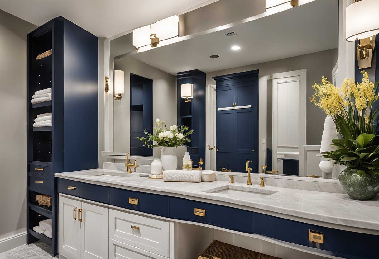
In modern bathrooms, the use of contrasting colors creates a bold and fresh environment. For example, pairing a deep navy blue with crisp white fixtures enhances the sleek lines typically found in contemporary designs.
Many homeowners opt for black wall tiles combined with white accents. This color scheme provides a dramatic effect while maintaining a clean aesthetic. To add warmth, they might introduce wooden elements, such as floating shelves or a vanity.
Additionally, using bright colors like turquoise or orange for accessories—think towels, rugs, and shower curtains—can infuse energy into the space without overwhelming it.
This technique allows for personal expression while keeping the overall look cohesive.
Classic Elegance: A Timeless Approach
Classic bathrooms often utilize contrasting colors to achieve sophistication and style. One effective method is the combination of soft creams with rich browns. This pairing can be seen in traditional cabinetry set against lighter wall colors.
Marble countertops are a popular choice, bringing both beauty and durability. Using dark accents like brass fixtures or a matte black sink can add a touch of elegance and modernity.
Another popular trend is using pastel colors like pale blue or soft green as base hues, complemented by darker shades in decorative items. Mixing textures, such as smooth tiles with woven baskets or wooden elements, enhances the visual interest.
These approaches showcase how classic designs can still utilize contrasting colors to create a fresh, inviting atmosphere.
Frequently Asked Questions

Choosing contrasting colors for a bathroom involves understanding several factors, including color theory and personal taste. It is important to know how colors affect mood and how to balance vibrant tones with calming elements.
What factors should be considered when choosing a contrasting color palette for a bathroom?
Factors to consider include the size of the space, natural light, and existing fixtures. Dark colors can make a small bathroom feel cramped, while light colors can create an open, airy feeling. The contrast should also complement other elements, like tiles and furniture.
How does color theory apply to designing a dynamic bathroom?
Color theory shows how colors interact based on their positions on the color wheel. Complementary colors create strong contrast, while analogous colors offer a more serene effect. Understanding these relationships helps in selecting colors that enhance each other rather than clash.
What are the best practices for incorporating colorful fixtures in a bathroom design?
Using colorful fixtures can add personality to a bathroom. It is useful to limit the number of vibrant fixtures to avoid overwhelming the space. Pairing colorful elements with neutral backgrounds works well to keep the design cohesive.
How can one achieve a balance between bold and soothing colors in a bathroom setting?
A good balance can be achieved by using bold colors as accents against softer base colors. This method allows for the introduction of energy without overwhelming the senses. It is beneficial to use accessories like towels and art to add splashes of color.
What are the psychological effects of certain colors in a bathroom space?
Colors can evoke different feelings and moods. Blue is often considered calming, while yellow can invigorate and uplift. Understanding these effects helps in creating a bathroom atmosphere that aligns with personal preferences and needs.
What are some tips for selecting tiles and accessories to enhance the bathroom color scheme?
Choosing tiles with complementary or contrasting hues can enhance the overall design. It is important to consider texture and finish, as glossy tiles reflect light differently than matte ones. Accessories like shower curtains and rugs can also tie the color scheme together effectively.