Transforming a bathroom into a vibrant oasis can be as simple as choosing the right color combinations. Contrasts that wow can breathe new life into even the smallest spaces, making a bold statement that reflects personal style. The right colors not only enhance aesthetics but also create a mood, making the bathroom a place of relaxation and rejuvenation.
Visually striking pairings such as deep navy with crisp white or rich emerald green with soft blush can energize the space while maintaining a balanced feel. Incorporating these bold colors through walls, tiles, and accessories adds character without overwhelming the senses.
Whether aiming for a retro vibe with earthy tones or a modern look with playful accents, every choice matters. Dive into the world of color to discover combinations that not only stand out but also elevate the bathroom experience.
Fundamentals of Color Theory in Bathroom Design
Color theory plays a crucial role in bathroom design, helping to create a space that is both functional and visually appealing. Understanding how colors interact and the effects of light can enhance the overall atmosphere of the bathroom.
Understanding Color Relationships
Colors can be grouped into primary, secondary, and tertiary categories. Primary colors (red, blue, yellow) mix to create other colors. Secondary colors (green, orange, purple) arise from mixing primary colors. Tertiary colors appear when primary and secondary colors blend.
In design, complementary colors sit opposite each other on the color wheel, such as blue and orange. They create a strong contrast that attracts attention. Analogous colors, like blue, blue-green, and green, are next to each other on the wheel. They provide a harmonious flow.
Using a mix of these relationships can balance vibrancy and calmness in a bathroom. This balance is essential for creating a relaxing space.
The Impact of Light on Colors
Lighting significantly affects how colors are perceived. Natural light reveals the true tone and vibrancy of colors. Rooms with ample natural light can handle bolder shades, which can brighten the space.
Artificial light can change how colors look. For instance, warm bulbs may enhance reds and yellows, while cool bulbs might make blues and greens pop. Positioning fixtures can also create shadows, altering the effect of color.
Choosing light fixtures that complement the chosen color scheme ensures the bathroom retains its intended mood. Testing colors under various lighting conditions can help achieve the desired effect.
Selecting a Bold Color Palette

Choosing the right color palette is essential for creating a bold bathroom design. By understanding different color combinations, one can achieve striking effects that energize the space. The following methods outline how to combine colors for a lively atmosphere.
Combining Complementary Colors
Complementary colors sit opposite each other on the color wheel. This means that they create a strong contrast. For instance, pairing blue and orange can make both colors pop.
To use this method effectively, choose two shades: one as a dominant color and the other as an accent. This creates visual interest without overwhelming the space. When using this combination, consider adding neutral colors, like white or gray, to balance boldness.
Details like towels and artwork can showcase these colors, enhancing the overall appeal.
Incorporating Analogous Colors for Harmony
Analogous colors are next to each other on the color wheel. They create a soothing, harmonious look. An example would be green, blue, and teal. These colors work well together and can bring a serene feel to a bathroom.
To implement this scheme, choose three colors. Pick one as the primary color and use the others as accents. This method allows for variety while maintaining unity. To enhance the design, add textures like wood or metal, which can complement the colors without clashing.
Adding plants can also enhance the harmonious feel, as their natural greens blend well with analogous palettes.
Introducing Triadic Schemes for Vibrancy
Triadic color schemes consist of three colors evenly spaced on the color wheel. This approach offers a vibrant yet balanced aesthetic. For example, red, yellow, and blue create a lively bathroom environment.
To use a triadic scheme, choose one dominant color and the other two as accents. This ensures one color stands out, while the others provide support. It’s essential to maintain balance; using one color more than the others helps prevent a chaotic look.
Bold accessories like rugs, shower curtains, and decor can showcase these colors effectively. Keeping larger elements neutral can ground the vibrancy, making the space feel cohesive.
Implementing Your Color Scheme

Creating a vibrant bathroom involves careful planning to ensure the chosen colors work well together. The following key factors will help bring a bold vision to life, focusing on color balance, the right textures, and thoughtful accents.
Balancing Bold Colors with Neutrals
To make bold colors stand out, they should be balanced with neutral tones. Using whites, greys, or beiges helps to ground the space.
For example:
- Wall Colors: Consider painting the walls in a soft white while featuring bold-colored tiles on the floor.
- Fixtures: Opt for neutral sinks, tubs, or vanities to avoid overwhelming the eye.
This contrast allows vibrant hues to remain the focal point. Additionally, using trim or moldings in neutral shades can further enhance the bold colors without competing for attention.
Textures and Materials to Enhance the Palette
Incorporating various textures and materials adds depth to a bathroom’s design. Mixing shiny surfaces with matte finishes creates contrast that can highlight colors beautifully.
- Tile Choices: Glossy tiles can reflect light, making bold colors appear even more vibrant.
- Finishes: Matte paint or textured wallpaper can soften the look and provide a tactile experience.
Consider natural materials like wood or stone for warmth. These can also act as neutral bases to complement brighter shades. Using textiles such as towels and rugs in matching or contrasting textures adds another layer of interest.
Accessorizing with Colorful Accents
Accents are vital for injecting personality into a bathroom. Items such as towels, soap dispensers, and decorative elements can feature the bold colors chosen for the main scheme.
- Patterns: Use patterned rugs or shower curtains that incorporate your key colors to tie the design together.
- Plants: Adding greenery in colorful pots can bring life to the space.
Ensure accents are placed thoughtfully to create a coherent look. Using a mix of different shapes and sizes can lead to a vibrant and inviting atmosphere. Aim for balance, ensuring that the overall design feels cohesive while showcasing the chosen colors effectively.
Case Studies: Bold Bathrooms Done Right

Many homeowners have transformed their bathrooms using bold colors. These examples show how striking combinations can create a stunning impact.
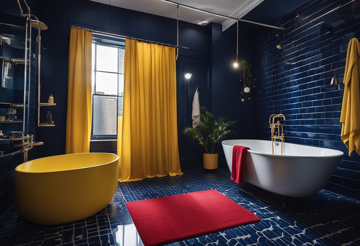
1. Deep Blue and Gold: A bathroom featured rich navy walls paired with gold fixtures. This combination adds a touch of luxury and elegance. The deep color makes the space feel cozy.
2. Bright Coral and White: One design used coral tiles with crisp white features. The bright coral energizes the room, making it feel cheerful. White accents keep it fresh and modern.
3. Black and Vibrant Green: Another example showcased black walls contrasted with vibrant green accessories. This striking look combines sophistication with a pop of color, creating a dramatic effect.
4. Soft Pastels with Dark Accents: A unique case displayed soft pastel colors accented by dark fixtures. The pastels create a calm atmosphere, while the darker elements add depth and interest.
5. Earthy Tones and Bright Accents: Finally, a design included earthy browns with bright orange accessories. This blend brings warmth while the orange adds a playful touch, making the bathroom inviting.
These case studies illustrate how bold colors can create beautiful, functional spaces. Each design effectively uses contrast to enhance the overall aesthetic of the bathroom.
Frequently Asked Questions

This section addresses common inquiries about bold color combinations in bathroom design. It covers vibrant colors that enhance space, tips for choosing color schemes, current trends, and color coordination techniques.
What are some vibrant color combinations that can make a small bathroom appear larger?
Light colors often create an illusion of spaciousness. Combinations like soft blues with white trim can open up the area. A pastel palette, such as mint green and pale yellow, can also brighten and expand the visual space.
How do I choose a bold color scheme for a modern bathroom?
Selecting a bold color scheme involves balancing contrasts. Dark colors, like navy or deep green, paired with sleek white fixtures create a striking look. Incorporating metallic accents, like gold or chrome, can enhance a modern feel.
What are the trending bathroom colour ideas for 2024?
In 2024, deep jewel tones like emerald green and sapphire blue are rising in popularity. Earthy colors, including terracotta and warm taupe, also feature prominently. These trends provide a rich atmosphere, moving away from softer pastels.
Which color pairings work best for a bedroom and bathroom to create a harmonious look?
Soft neutrals, combined with pastels, are ideal for a cohesive look. Colors like dusty rose in the bedroom with soft gray in the bathroom create a unified feel. Coordinating colors, such as pale lavender and cream, also promote harmony between spaces.
What are the most flattering color choices for bathroom lighting and mirrors?
Warm whites and soft yellows are flattering for lighting, enhancing the bathroom’s overall ambiance. For mirrors, silver or gold frames can complement various color schemes. With the right colors, lighting can elevate the bathroom’s atmosphere significantly.
How can I effectively coordinate colors in a bathroom design for maximum impact?
To coordinate colors effectively, start with a dominant hue and build around it. Adding accent colors through accessories or fixtures can create visual interest. Using different shades of the same color can also unify the design while adding depth.