Color has a powerful effect on our mood and emotions. It can transform a dull room into a vibrant space, or create a calming atmosphere in a chaotic environment. When it comes to choosing the perfect paint for your living room, the options can be overwhelming. With so many different shades, tones, and finishes available, it can be difficult to know where to start.
One of the first things to consider when choosing a paint color for your living room is the overall style and aesthetic you want to achieve. Are you looking for a cozy, intimate space or a bright and airy atmosphere? Do you want to create a bold statement or a subtle backdrop for your furniture and decor? Answering these questions can help guide you towards the right color palette for your living room.
Understanding Color Psychology
Emotional Responses to Colors
Colors can evoke a wide range of emotional responses in people. Understanding these responses can help you choose the perfect paint color for your living room. Here are some common emotional responses to colors:
- Red: Red is associated with passion, energy, and excitement. It can increase heart rate and blood pressure, and is often used to create a sense of urgency.
- Blue: Blue is associated with calmness, serenity, and relaxation. It can lower heart rate and blood pressure, and is often used to create a sense of tranquility.
- Yellow: Yellow is associated with happiness, optimism, and warmth. It can stimulate the nervous system and increase mental activity, and is often used to create a sense of cheerfulness.
- Green: Green is associated with nature, growth, and harmony. It can have a calming effect and is often used to create a sense of balance.
- Purple: Purple is associated with luxury, creativity, and spirituality. It can have a calming effect and is often used to create a sense of sophistication.
Cultural Associations of Colors
Colors can also have different cultural associations. Here are some common cultural associations of colors:
- Red: In many cultures, red is associated with luck, happiness, and prosperity. In some cultures, however, it is associated with danger and warning.
- Blue: In Western cultures, blue is associated with trust, loyalty, and professionalism. In some Eastern cultures, however, it is associated with sadness and mourning.
- Yellow: In many cultures, yellow is associated with happiness and optimism. In some cultures, however, it is associated with cowardice and betrayal.
- Green: In many cultures, green is associated with nature, growth, and health. In some cultures, however, it is associated with jealousy and envy.
- Purple: In many cultures, purple is associated with royalty, luxury, and power. In some cultures, however, it is associated with mourning and death.
Understanding the emotional and cultural associations of colors can help you choose the perfect paint color for your living room. Keep in mind that different people may have different emotional and cultural associations with colors, so it’s important to consider your own personal preferences as well.
Analyzing Your Living Room Space

Evaluating Room Size and Layout
Before choosing a paint color for your living room, it’s important to evaluate the size and layout of the space. A small room can feel cramped and claustrophobic with the wrong color, while a large room can feel cold and unwelcoming with a color that’s too light or too dark.
To determine the size of your living room, measure the length and width of the room and multiply the two numbers together. If your living room has an unusual shape, break it down into smaller sections and measure each one separately.
Once you know the size of your living room, consider the layout. Is it an open floor plan, or are there separate areas for seating and dining? Will the color you choose complement the furniture and decor already in the room?
Considering Natural and Artificial Light
Another important factor to consider when choosing a paint color for your living room is the amount of natural and artificial light in the space. A room with lots of natural light can handle a bolder color, while a room with limited natural light may benefit from a lighter, brighter color.
It’s also important to consider the type of artificial light in the room. Warm-toned bulbs can make a color appear more yellow or orange, while cool-toned bulbs can make a color appear more blue or green.
To get a better idea of how a color will look in your living room, paint a small section of the wall and observe it at different times of day and under different types of lighting. This will help you make an informed decision and ensure that you choose a color that looks great in any light.
Selecting Your Color Palette

Color Wheel Basics
Before choosing a color for your living room, it’s important to understand the basics of the color wheel. The color wheel is a tool that helps you understand how colors relate to each other. It’s divided into primary colors (red, blue, and yellow), secondary colors (orange, green, and purple), and tertiary colors (yellow-green, blue-green, blue-purple, red-purple, red-orange, and yellow-orange).
When selecting colors for your living room, consider the color temperature. Warm colors (such as red, orange, and yellow) create a cozy and inviting atmosphere, while cool colors (such as blue and green) create a calming and relaxing atmosphere. Neutral colors (such as beige and gray) work well as a base for any color scheme.
Creating Color Harmony
Creating color harmony is essential when selecting a color palette for your living room. One way to achieve color harmony is by using a monochromatic color scheme. This involves using different shades and tints of the same color. Another way is by using complementary colors, which are colors that are opposite each other on the color wheel. For example, blue and orange or red and green.
Analogous colors are colors that are next to each other on the color wheel and can create a harmonious and calming atmosphere. For example, yellow, yellow-green, and green. Triadic colors are three colors that are equally spaced on the color wheel, such as red, blue, and yellow.
Accent Colors and Focal Points
When selecting a color palette for your living room, it’s important to consider accent colors and focal points. Accent colors are colors that are used sparingly to add interest and depth to a room. Focal points are areas of the room that draw the eye and create a sense of balance.
One way to create an accent color is by using a bold color on a single wall or as an accent piece of furniture. Another way is by using patterned fabrics or accessories that incorporate the accent color. Focal points can be created using artwork, a fireplace, or a statement piece of furniture.
In conclusion, selecting a color palette for your living room requires an understanding of the color wheel, creating color harmony, and considering accent colors and focal points. By following these guidelines, you can create a cohesive and inviting living room that reflects your personal style.
Paint Types and Finishes

Comparing Paint Types
When it comes to choosing the right paint for your living room, it’s important to understand the different types of paint available. The most common types of paint are oil-based and water-based. Oil-based paints are known for their durability and resistance to wear and tear, while water-based paints are easier to clean up and have less odor.
Another important consideration is the sheen or gloss level of the paint. High-gloss paints are shiny and reflective, making them a popular choice for trim and doors. However, they can also highlight imperfections on the surface. Flat or matte paints, on the other hand, have a low sheen and are better at hiding imperfections.
Choosing the Right Finish
Once you’ve decided on the type of paint, it’s important to choose the right finish. The finish of the paint determines how the color will appear and how durable the paint will be.
For high-traffic areas like living rooms, a satin or eggshell finish is a good choice. These finishes have a slight sheen and are easier to clean than flat or matte finishes. Semi-gloss and high-gloss finishes are even more durable, but can be too shiny for some people’s tastes.
For ceilings and walls with imperfections, a flat or matte finish is a better choice. These finishes don’t reflect light as much as other finishes, making imperfections less noticeable. However, they are not as durable as other finishes and can be more difficult to clean.
Overall, choosing the right paint type and finish can make a big difference in the look and durability of your living room. Take the time to consider your options and choose the best paint for your needs.
Color Trends and Inspiration

Exploring Current Trends
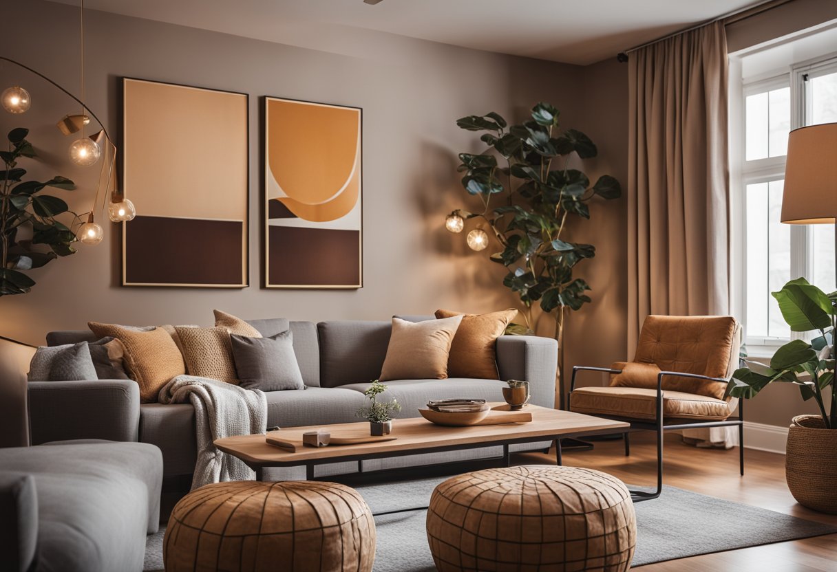
Staying up to date with the latest color trends can be a great way to give your living room a fresh, modern look. In recent years, neutral shades like beige, gray, and white have been popular choices for living room walls. These colors provide a clean, minimalist look that can be easily accented with bold pops of color in furniture, artwork, and accessories.
Another trend that has been gaining popularity is the use of bold, saturated colors like deep blues, rich greens, and warm oranges. These colors can add a sense of drama and sophistication to your living room, and work well when paired with neutral furniture and décor.
For those who prefer a more subtle approach, pastel shades like soft pinks and light blues can create a calming, relaxing atmosphere. These colors work well in rooms with lots of natural light, and can be paired with natural materials like wood and stone for a cozy, organic feel.
Finding Inspiration
If you’re feeling stuck when it comes to choosing the perfect color for your living room, there are plenty of places to find inspiration. Home décor magazines and websites can be a great source of ideas, as can social media platforms like Pinterest and Instagram.
Another option is to take inspiration from nature. Think about the colors of the sky, the ocean, or a beautiful sunset, and use those shades as a starting point for your color scheme. You can also take inspiration from your favorite artwork or textiles, and use those colors as a guide for your paint choices.
Ultimately, the most important thing is to choose a color that you love and that makes you feel comfortable in your space. Don’t be afraid to experiment with different shades and combinations until you find the perfect fit for your living room.
Practical Considerations

Maintenance and Durability
When choosing a paint color for your living room, it’s important to consider the maintenance and durability of the paint. A high-traffic area like a living room requires a paint that can withstand wear and tear.
It’s recommended to choose a paint with a satin or semi-gloss finish as they are easier to clean and maintain. Flat or matte finishes are more prone to scuffing and staining, which can be difficult to remove.
Additionally, it’s important to choose a paint that is resistant to fading and peeling. Look for paints that have a high-quality resin and pigment content, which will ensure that the color stays vibrant for longer periods of time.
Preparing for a Paint Job
Before starting a paint job, it’s important to properly prepare the surfaces to be painted. This includes cleaning the walls, repairing any cracks or holes, and sanding down any rough spots.
Using a primer before painting can also help ensure that the paint adheres properly and lasts longer. It’s recommended to use a primer that is specifically designed for the type of paint being used.
When choosing a paint color, it’s a good idea to test a small area first to see how it looks in the room’s lighting. It’s also important to purchase enough paint to ensure that there is enough to complete the job and touch up any areas if needed.
By considering maintenance and durability and properly preparing for a paint job, you can choose the perfect paint color for your living room that will last for years to come.
Implementing Your Color Scheme

Coordinating with Furniture and Decor
When choosing a color scheme for your living room, it’s important to consider how it will coordinate with your furniture and decor. One helpful tip is to choose a dominant color from your furniture or decor and use that as the primary color in your paint scheme. For example, if you have a bold red couch, you could choose a neutral beige or gray for the walls to complement it.
Another option is to choose a color that contrasts with your furniture or decor. This can create a bold and striking look, but it’s important to make sure the colors don’t clash. A helpful tool for this is a color wheel, which can show you complementary and contrasting colors.
Visualizing the Final Look
Before committing to a paint color, it’s important to visualize how it will look in your living room. One way to do this is to use online tools or apps that allow you to upload a photo of your living room and try out different paint colors virtually.
Another option is to purchase small paint samples and test them out on your walls. This can give you a better idea of how the color will look in different lighting and at different times of day.
Overall, coordinating your color scheme with your furniture and decor and visualizing the final look can help ensure a cohesive and visually pleasing living room.