The psychology of color in home design is a fascinating topic that has been studied by interior designers and psychologists alike. Colors can have a profound effect on a person’s mood, emotions, and behavior, making it an important consideration when designing a living space. The use of color can create a certain ambiance, evoke specific emotions, and even affect a person’s physical well-being.
Color psychology is the study of how color affects human behavior, and it has been used in various fields, including marketing, advertising, and interior design. When it comes to home design, the psychology of color plays a significant role in creating a comfortable and inviting living space. By using the right colors in the right way, designers can create an atmosphere that promotes relaxation, productivity, or even romance.
In this article, we will explore the psychology of color in home design, examining the different emotions and moods that various colors can evoke. We will also discuss how to use color effectively in different rooms of the home, taking into consideration factors such as lighting, room size, and personal preferences. Whether you are looking to create a cozy bedroom, a vibrant living room, or a serene home office, understanding the psychology of color can help you achieve your desired outcome.
The Fundamentals of Color Psychology
Color psychology is the study of how colors affect human behavior, emotions, and moods. It is a complex science that explores how different hues can impact our thoughts and feelings. Understanding the fundamentals of color psychology is essential for creating a harmonious and balanced home design.
One of the primary factors that influence color psychology is hue. Hue refers to the pure color of an object, such as red, blue, or green. Each hue has its own unique psychological effect on people. For example, red is often associated with passion, excitement, and energy, while blue is associated with calmness, serenity, and trust.
Another important aspect of color psychology is saturation. Saturation refers to the intensity or purity of a color. Highly saturated colors are more vibrant and intense, while desaturated colors are more muted and subdued. The saturation of a color can affect the emotional impact it has on people. For example, highly saturated colors can be energizing and stimulating, while desaturated colors can be calming and soothing.
Finally, brightness or value is another factor in color psychology. Brightness refers to the lightness or darkness of a color. Bright colors are more cheerful and optimistic, while darker colors are more serious and somber. The brightness or value of a color can also affect the psychological impact it has on people.
In summary, understanding the fundamentals of color psychology is crucial for creating a home design that promotes a positive and harmonious atmosphere. By considering the hue, saturation, and brightness of different colors, designers can create spaces that evoke specific emotions and moods.
Color Theory in Home Design

Warm vs. Cool Colors
When it comes to color theory in home design, one of the most fundamental concepts is the distinction between warm and cool colors. Warm colors, such as red, orange, and yellow, are often associated with energy, excitement, and warmth. They can create a sense of coziness and intimacy in a room, making them a popular choice for living spaces and bedrooms.
On the other hand, cool colors, such as blue, green, and purple, are often associated with calmness, relaxation, and serenity. They can create a sense of spaciousness and tranquility in a room, making them a popular choice for bathrooms and home offices.
Color Wheel and Complementary Colors
Another important concept in color theory is the color wheel and complementary colors. The color wheel is a tool that helps designers understand how different colors relate to each other and how they can be combined to create different effects.
Complementary colors are colors that are opposite each other on the color wheel, such as red and green or blue and orange. When used together, complementary colors can create a vibrant and dynamic contrast that adds interest and energy to a room.
Designers can also use analogous colors, which are colors that are next to each other on the color wheel, to create a more harmonious and cohesive color scheme. For example, a designer might use shades of blue and green together to create a calming and serene atmosphere in a bedroom.
Understanding color theory is an essential part of creating a successful and visually appealing home design. By using warm and cool colors effectively and choosing complementary or analogous color schemes, designers can create spaces that are both beautiful and functional.
Emotional Effects of Color

Color has a powerful impact on our emotions and can greatly influence our mood. Different colors can evoke different emotions and have varying effects on our mental and physical well-being. In this section, we will explore the emotional effects of three primary colors in home design: red, blue, and yellow.
Red’s Energy
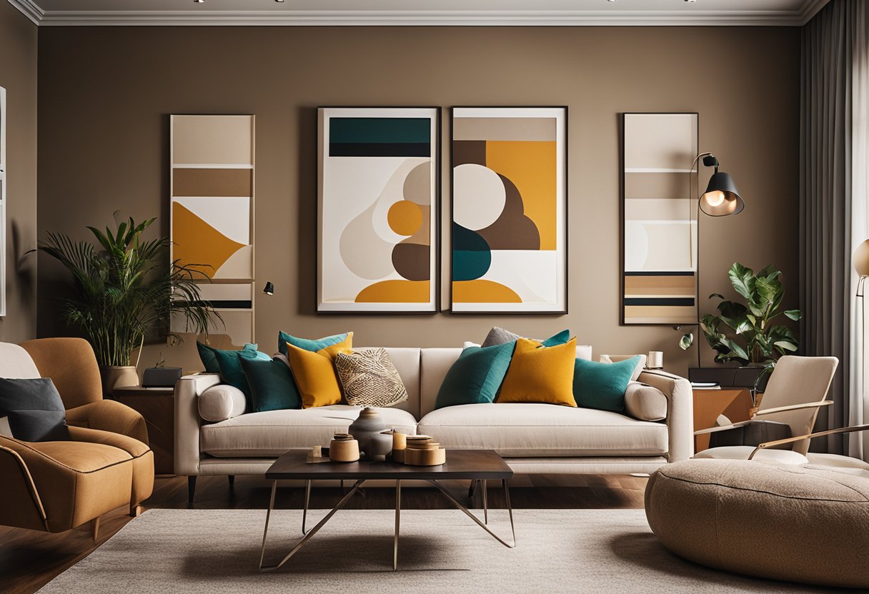
Red is a bold and powerful color that is often associated with energy, passion, and excitement. It can stimulate the senses and increase heart rate, blood pressure, and respiration. Red is a great color for spaces where people gather and socialize, such as living rooms and dining rooms. It can also be used in home gyms or workout areas to provide a burst of energy and motivation.
However, too much red can be overwhelming and even agitating. It is important to balance red with other calming colors, such as blue or green, to create a harmonious and balanced space.
Blue’s Serenity
Blue is a calming and soothing color that is often associated with serenity, tranquility, and relaxation. It can lower blood pressure, slow down respiration, and reduce anxiety and stress. Blue is a great color for bedrooms and bathrooms, where relaxation and rest are important.
However, too much blue can create a cold and sterile environment. It is important to balance blue with warm colors, such as yellow or orange, to create a cozy and inviting space.
Yellow’s Cheerfulness
Yellow is a bright and cheerful color that is often associated with happiness, optimism, and creativity. It can stimulate the brain and increase mental activity, which makes it a great color for home offices or creative spaces. Yellow is also a great color for kitchens and dining rooms, where it can stimulate the appetite and create a warm and inviting atmosphere.
However, too much yellow can be overwhelming and even create feelings of anxiety or frustration. It is important to balance yellow with other calming colors, such as blue or green, to create a harmonious and balanced space.
Also check: Preparing Surfaces for Painting: Cleaning, Sanding, and Priming Tips
Color and Spatial Perception

Color has a significant impact on how we perceive the size and space of a room. Lighter colors tend to make a space appear larger, while darker colors make it appear smaller and more enclosed. This phenomenon can be attributed to the way our eyes perceive color and light.
Light Colors and Space Expansion
Lighter colors such as white, beige, and pastel shades reflect more light than darker colors. As a result, they create a sense of openness and airiness in a room, making it feel more spacious. Light colors also reflect natural light more effectively, which can make a room feel brighter and more inviting.
Using light colors on walls, ceilings, and floors can help create the illusion of more space. Additionally, using light-colored furniture and accessories can also contribute to a more expansive feel. For example, a white sofa in a small living room can make the space feel larger than a dark-colored one.
Dark Colors for Cozy Spaces
While light colors are ideal for creating a sense of spaciousness, darker colors can create a cozy and intimate atmosphere. Dark colors absorb more light, making a room feel smaller and more enclosed. This can be ideal for creating a warm and inviting space, such as a bedroom or a study.
Using dark colors on walls, floors, and furniture can create a sense of depth and richness in a room. However, it is important to balance dark colors with lighter shades to avoid a sense of heaviness. For example, a dark blue accent wall in a living room can be balanced with light-colored furniture and accessories.
Overall, the use of color in home design can significantly impact our perception of space and size. By understanding how color affects spatial perception, homeowners can use color to create the desired atmosphere in their homes.